Article · Transit · 8 min read
The TTC stations with the highest delay intensity aren't the busiest ones
Our April piece on TTC subway delays flagged a missing piece: per-station usage data to weigh delay records against. That lets each station's numbers reflect its own scale, not just raw station size. We pulled TTC's own figures and built the map. Adjusted for typical-weekday station activity, the ranking looks nothing like the raw count, and the busiest stations mostly disappear from the top of it.
TTC Delay Series
- Part 1 · What's Delaying the Subway
- Part 2 · Where It's Worst
- Part 3 · Delay Minutes
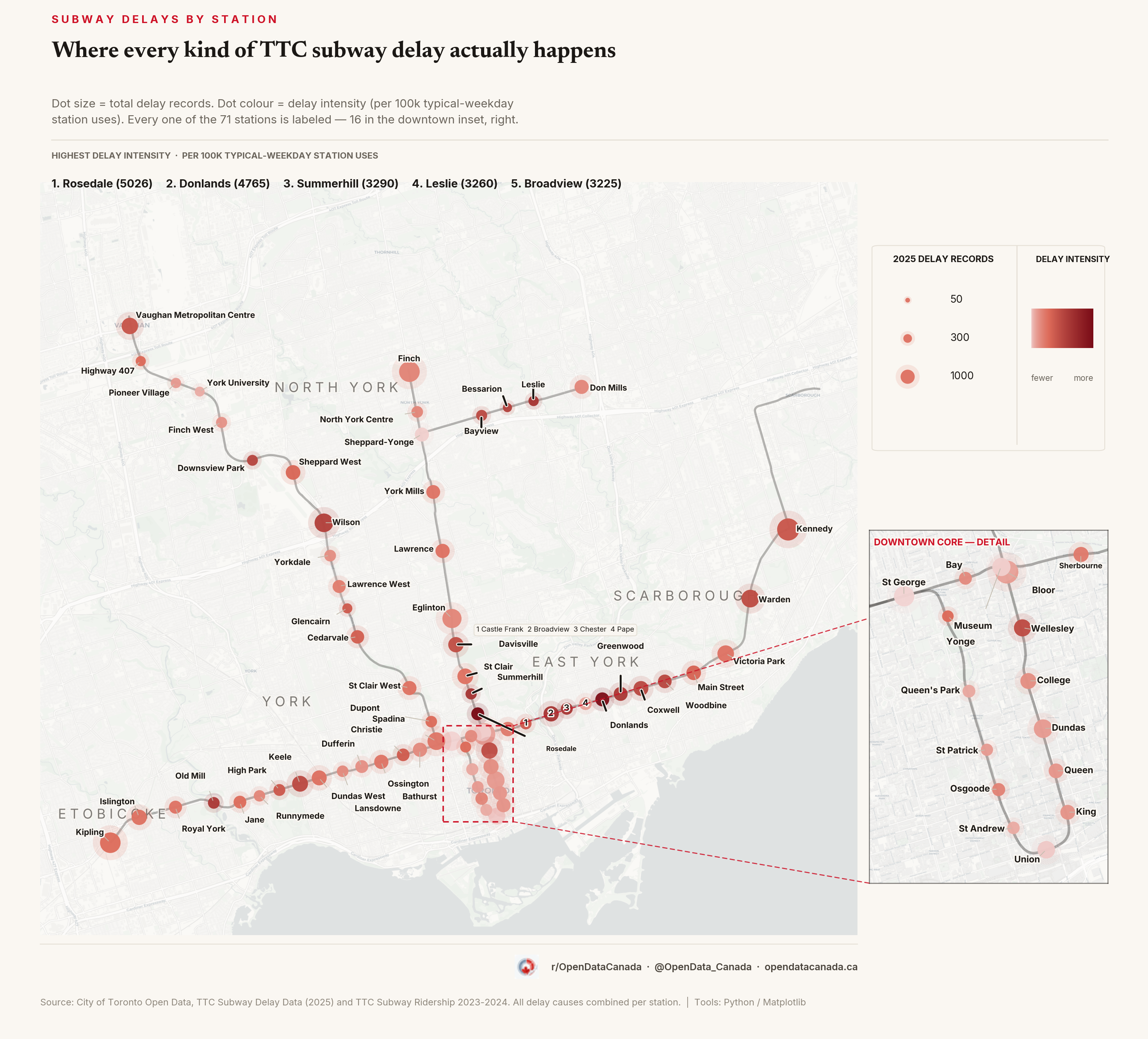
Hover any station below to see its own 2025 numbers: total delay time, incident count, and the average length of a single delay.
Our previous piece on subway delays worked entirely from the raw delay-record file: which categories cause the most delay time, which line carries the biggest share, when disorderly-patron incidents actually happen. In the "what would update the chart" section we named the gap directly: per-station usage data to weigh raw counts against, which does not ship in the open-data release. Without it, every station-level count is really just a proxy for station size: big interchange hubs top every list by construction, because more trains and more platform activity mean more opportunities for a record to be logged.
That's also the number that tends to circulate. A station near the top of a "most delays" list gets repeated in transit chatter without anyone checking whether that's because the station is genuinely delay-prone, or just because it's a major hub like Bloor-Yonge, where hundreds of thousands of people pass through on a typical weekday. Adjusting for that scale changes which stations look like problems and which turn out to just be consequences of size.
We went and got it. TTC's own Subway Ridership 2023-2024 report publishes typical-weekday station usage for every station, in TTC's words "the number of customers travelling to and from each station platform on a typical weekday." That's a different figure from the line-level "boardings" total the same report also publishes (Line 1 as a whole: 625,467 boardings). We're using the station-specific usage figure, station by station, split by line where a station serves two lines. Joined against 2025's subway delay records, station by station, that turns a raw count into an adjusted delay intensity: records per 100,000 typical-weekday station uses.
The ranking flips when you adjust for station activity
Rank stations by raw 2025 record count and the list is the busiest stations on the network, in order: Kennedy, Bloor, Finch, Kipling, St George.
Rank the same stations by delay intensity (records per unit of station activity, not records per station) and eight of those twenty barely survive: Broadview, Davisville, Keele, Kennedy, Vaughan Metropolitan Centre, Warden, Wellesley and Wilson are the only stations that appear in both top twenties. The other twelve spots in the adjusted top twenty are filled by stations that don't crack the raw top twenty at all, led by Rosedale, Donlands, Summerhill and Leslie, four names that appear nowhere near the top of a raw-count ranking.
St George, one of the busiest stations in the system (209,994 typical-weekday station uses), has the lowest delay intensity on the entire map: 326 records per 100,000 station uses. Rosedale, a small Line 1 station between Summerhill and Bloor-Yonge with under 5,000 typical-weekday station uses, tops the list at just over 5,000 per 100,000, roughly fifteen times higher.
| Rank | Station | 2025 delay records | Typical-weekday station usage | Delay intensity (per 100k) | Percentile |
|---|---|---|---|---|---|
| 1 | Rosedale | 245 | 4,875 | 5,025.6 | 100th |
| 2 | Donlands | 301 | 6,317 | 4,764.9 | 99th |
| 3 | Summerhill | 166 | 5,045 | 3,290.4 | 97th |
| 4 | Leslie | 130 | 3,988 | 3,259.8 | 96th |
| 5 | Broadview | 378 | 11,720 | 3,225.3 | 94th |
| 6 | Chester | 199 | 6,197 | 3,211.2 | 93rd |
| 7 | Greenwood | 298 | 9,567 | 3,114.9 | 91st |
| 8 | Old Mill | 187 | 6,109 | 3,061.1 | 90th |
| 9 | Wilson | 620 | 21,579 | 2,873.2 | 89th |
| 10 | Bessarion | 91 | 3,180 | 2,861.6 | 87th |
| 11 | Downsview Park | 153 | 5,618 | 2,723.4 | 86th |
| 12 | Woodbine | 285 | 10,803 | 2,638.2 | 84th |
| 13 | Coxwell | 351 | 13,450 | 2,609.7 | 83rd |
| 14 | Keele | 419 | 16,305 | 2,569.8 | 81st |
| 15 | Bayview | 159 | 6,205 | 2,562.4 | 80th |
| 16 | Wellesley | 446 | 17,705 | 2,519.1 | 79th |
| 17 | Warden | 546 | 21,843 | 2,499.7 | 77th |
| 18 | Davisville | 381 | 15,903 | 2,395.8 | 76th |
| 19 | Vaughan Metropolitan Centre | 456 | 20,394 | 2,236.0 | 74th |
| 20 | Kennedy | 933 | 42,881 | 2,175.8 | 73rd |
Don't read this as a precise league table
Rosedale has the highest observed delay intensity in the network. That's a different claim from saying Rosedale is definitively worse than Donlands, its closest rival. Rosedale's 245 records and Donlands' 301 records both carry real sampling uncertainty: using a standard 95% interval around each count, Rosedale's plausible range is roughly 4,400 to 5,660 per 100,000, and Donlands' is roughly 4,230 to 5,300. Those ranges overlap substantially. Rosedale has the highest measured rate this year; that doesn't mean it's been shown to be worse than its nearest neighbour.
That uncertainty widens for every station further down the list, because it's a function of how few records each station logs. It's a real limitation of ranking on small counts: when both the numerator and the denominator are small, a handful of additional records can move a station's position substantially. Treat the top few positions as a real, if imprecise, signal, and treat exact rank order in the bottom half of the table as much softer.
What "delay intensity" actually measures
This isn't passenger-minutes lost, and it isn't the odds that any individual rider hits a delay. Station usage counts people travelling to and from each station platform; it doesn't tell us whether a given delay record affected someone passing through that station on that particular train. What's plotted here is better described as how often a delay record gets logged at a station, relative to how much activity passes through it, not how many people it affects.
Four stations in TTC's ridership report serve two subway lines and so get two separate usage figures, listed twice: St George, Bloor-Yonge, Spadina and Sheppard-Yonge. We combine three of them into a single row using their two-line total, because the underlying delay log doesn't distinguish the two platforms by name. St George reports 101,128 (Line 1) and 108,866 (Line 2), which we sum to 209,994 for the "busiest station, lowest intensity" comparison above; Spadina and Sheppard-Yonge are combined the same way. Bloor-Yonge is the exception: the delay log records its two platforms under genuinely separate names, "Bloor" and "Yonge," so we've kept it as two rows here too, matching TTC's own 121,531 (Line 2/Bloor-Danforth) and 156,643 (Line 1/Yonge-University) figures.
What gets counted
We counted every 2025 record we could match to one of the 71 stations in this analysis, across 129 distinct TTC delay codes that actually appear in the 2025 data: door faults, signal problems, disorderly patrons, weather, mechanical failures, medical aid, and the rest. About 90% of 2025 subway delay records match to a specific station this way; the rest are logged against non-station locations (yards, line segments, control divisions) that don't correspond to a single platform and are excluded from station totals. Unlike our previous article, which worked from delay-minute totals, this analysis counts every logged record regardless of duration: about 65% of 2025 subway delay records carry zero recorded delay minutes. TTC's delay-monitoring system logs these events whether or not they produced a measurable delay, so a station's count here reflects logged-event frequency, not lost time. That's a different measure from the previous article's hours-lost analysis, and the two aren't meant to be compared number-for-number.
About 9% of those records (2,378 of 25,737 in 2025) use TTC codes without a corresponding public description in the current codebook. We include them in the station totals rather than dropping them; they aren't assigned to a specific cause in this analysis, and we haven't broken them out by station.
Data and methodology
- Delay records: City of Toronto Open Data, TTC Subway Delay Data, calendar year 2025, all stations, all 129 codes that appear in the year's data.
- Station usage: TTC Subway Ridership 2023-2024, typical-weekday station usage, September 2023 through August 2024, about a year earlier than the delay records. Station-level usage doesn't move fast year to year, but treat the intensity figure as approximate for that reason.
- Delay intensity: 2025 delay records ÷ typical-weekday station usage × 100,000, an annual count set against a single typical day, not a literal daily rate.
- Uncertainty: approximate 95% intervals from a Poisson model on each station's record count, with the denominator held fixed.
- Station count: 71 rows for TTC's 70 stations; Bloor-Yonge is split into two because the delay log names its platforms separately.