Article · Transit · 12 min read
What's actually delaying the TTC subway — and the five layers underneath the chart
From January 2025 to January 2026 the TTC subway lost 1,385 hours to delays across 10,087 separate incidents. The headline finding hides five sharper ones underneath.
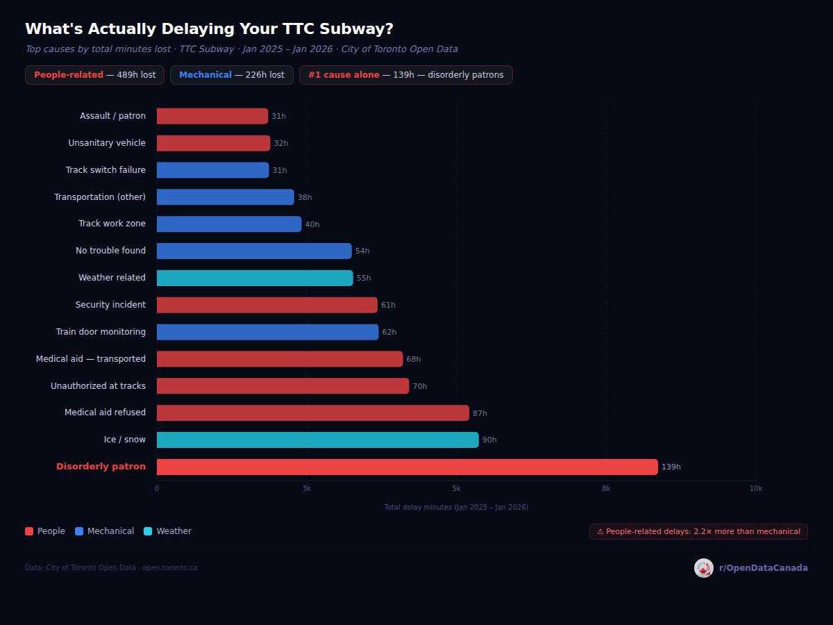
The chart above plots the top categories of TTC subway delay by hours lost in the rolling year ending January 2026. The original r/OpenDataCanada post that prompted this article hit roughly an order of magnitude more engagement than every other chart on the subreddit, which suggests the topic resonates. The chart itself is correct as far as it goes. This article is about the layers underneath it that don't fit on a single bar chart, plus an honest engagement with the four objections that came up consistently in the comment thread.
To do that honestly we pulled the raw TTC Subway Delay Data — the same City of Toronto Open Data file the chart was built from — and re-ran the analysis from scratch. Every number below is computed from those 28,191 records.
What the chart actually says
The headline numbers, verified from the raw file:
| Cause | Hours lost | Incidents | Avg minutes per incident |
|---|---|---|---|
| Disorderly patron | 139.4 | 1,265 | 6.6 |
| Ice / snow related | 89.6 | 73 | 73.6 |
| Medical aid — refused (on train) | 86.9 | 710 | 7.3 |
| Unauthorised at track level | 70.2 | 335 | 12.6 |
| Medical aid — transported (on train) | 68.5 | 359 | 11.4 |
| Train door monitoring (OPTO) | 61.7 | 691 | 5.4 |
| Security incident — other | 61.4 | 428 | 8.6 |
| Weather reports / related | 54.6 | 240 | 13.6 |
| Public-alarm — no trouble found | 54.2 | 786 | 4.1 |
| Track work zone problems | 40.3 | 210 | 11.5 |
| Transportation — other | 38.2 | 392 | 5.8 |
| Unsanitary vehicle | 31.6 | 428 | 4.4 |
| Track switch failure | 31.2 | 63 | 29.7 |
| Assault / patron involved | 31.0 | 167 | 11.1 |
| Priority One — train in contact with person | 30.0 | 22 | 81.8 |
All numbers reconcile to the chart. People-attributed causes (disorderly, medical, security, assault, unauthorised, unsanitary) total 489 hours. Mechanical and operational causes (door monitoring, switch failure, track work, transportation-other, no-trouble-found) total 226 hours. People-attributed delays exceed mechanical-attributed delays by 2.2 ×.
Layer one — per-incident severity flips the ranking
The chart is sorted by total hours lost, which is almost the right axis if your question is "where is the system bleeding the most time." It's the wrong axis if your question is "what are the worst single incidents." The two questions get different answers from the same dataset.
Sorted instead by average minutes per incident, the same data set looks like this:
| Cause | Avg minutes per incident | Total incidents in 13 months |
|---|---|---|
| Priority One — train in contact with person | 81.8 min | 22 |
| Ice / snow related | 73.6 min | 73 |
| Track switch failure | 29.7 min | 63 |
| Weather reports / related | 13.6 min | 240 |
| Unauthorised at track level | 12.6 min | 335 |
| Medical aid — transported | 11.4 min | 359 |
| Assault / patron involved | 11.1 min | 167 |
| Disorderly patron | 6.6 min | 1,265 |
Disorderly patrons are the top of the chart by total hours because they happen four times every day and chew up about six and a half minutes per incident. Priority-One incidents — trains striking a person on the tracks — happen on average less than twice a month but each one shuts down a section of the line for over an hour and a quarter. Ice and snow events are similar in shape: rare but enormous when they happen.
This means the policy question "where would I get the most delay reduction per dollar of intervention" splits into two very different sub-questions:
- If the goal is reducing the average commute's chance of delay, the high-frequency, low-severity people-related categories matter most. Reducing disorderly-patron incidents by even 30 % would save roughly 42 hours per year, more than eliminating switch failures entirely.
- If the goal is preventing the worst delays Torontonians actually remember, switch failures, ice/snow events, and Priority-One incidents matter more. A single switch failure produces a half-hour disruption on top of a network that runs on roughly 130-second headways at peak.
The chart frames the first question. The comments overwhelmingly responded to the second.
Layer two — Line 1 carries the lion's share
The chart aggregates all three subway lines. Broken out:
| Line | Hours lost | Incidents | Share of total delay time |
|---|---|---|---|
| Yonge–University (Line 1) | 782 | 5,628 | 56 % |
| Bloor–Danforth (Line 2) | 548 | 4,068 | 40 % |
| Sheppard (Line 4) | 55 | 390 | 4 % |
Line 1's share of delay time (56 %) is roughly proportional to its share of weekday ridership (the Yonge–University corridor carries about 60 % of subway boardings). Line 2 shows the opposite: 40 % of delays from a line that handles approximately 30 % of ridership — meaning Line 2 is delayed at roughly 1.3 × the per-rider rate of Line 1.
The Line 2 result is the more interesting one. Bloor–Danforth uses an older signalling system than Line 1's recently-completed Automatic Train Control upgrade, and the line's two terminal stations (Kipling and Kennedy) sit at the top of the per-station delay table for reasons mostly unrelated to passengers — they are the scheduled crew-change and turnaround points, where minor operational issues compound.
Layer three — when disorderly patron incidents actually happen
The chart treats "disorderly patron" as a single category. The hour-of-day breakdown for that single category is its own story:
| Hour | Hours lost | Incidents |
|---|---|---|
| 21:00 | 10.1 | 85 |
| 19:00 | 9.4 | 79 |
| 18:00 | 8.9 | 76 |
| 17:00 | 8.6 | 90 |
| 22:00 | 8.5 | 80 |
| 1:00 (after midnight) | 8.4 | 58 |
| 16:00 | 8.2 | 66 |
| 14:00 | 8.1 | 75 |
| 23:00 | 8.0 | 74 |
| 12:00 | 7.6 | 54 |
| 13:00 | 7.6 | 74 |
| 15:00 | 7.5 | 75 |
| 6:00 | 1.2 | 14 |
| 5:00 | 0.4 | 5 |
The pattern is not what most riders predict. Disorderly-patron delays peak at 9 PM, not during the morning or evening rush. Evening commute hours (5–6 PM) sit comfortably in the upper half of the table but are not the peak. There is a distinct secondary peak at 1 AM — bar-closing time — and the incident rate drops to almost zero between 3 AM and 6 AM.
The morning rush (7–9 AM) is the second-quietest part of the day for this category, behind only the overnight period. This argues against the most common framing of the problem (that "the rush-hour TTC is increasingly disorderly") and for a different framing: the disorderly-patron problem is concentrated in the evening and late evening, when train frequencies are lower, recovery from any individual incident is slower, and other commercial / nightlife activity is contributing inputs to the system.
Layer four — combining the medical-aid categories changes the headline
The chart treats four medical-aid codes as separate bars:
- Medical aid — refused, on train: 87 h, 710 incidents
- Medical aid — transported, on train: 68.5 h, 359 incidents
- Medical aid — refused, in station: 3 h, 36 incidents
- Medical aid — transported, in station: 3 h, 25 incidents
Combined: 161.5 hours, 1,130 incidents. That is 16 % more than the disorderly-patron total, and would be the single largest cause if the codes were combined. The TTC reports them separately because Transit Control codes them separately, and because the operational response is genuinely different (transported-vs-refused affects whether paramedics need stage access, on-train-vs-in-station affects whether the train gets held). The combination is an editorial choice, not a derivation. Both the chart's separation and our combination are defensible. We're flagging the choice because if your question is "what's the largest non-mechanical category of delay," the answer changes depending on it.
Layer five — where disorderly-patron delays cluster
The top fifteen stations for disorderly-patron incidents specifically:
| Station | Hours lost (disorderly) | Incidents |
|---|---|---|
| Bloor (Line 1, transfer to Yonge) | 5.0 | 70 |
| Eglinton (Line 1) | 4.6 | 42 |
| Kennedy (Line 2 terminal) | 4.2 | 39 |
| Sheppard West (Line 1) | 3.7 | 22 |
| Yonge (Line 2, transfer to Bloor) | 3.6 | 48 |
| Davisville (Line 1) | 3.5 | 35 |
| Union (Line 1) | 3.4 | 29 |
| St George (Line 1, transfer to Line 2) | 3.1 | 34 |
| Rosedale (Line 1) | 3.0 | 25 |
| St Clair West (Line 1) | 3.0 | 22 |
| College (Line 1) | 3.0 | 27 |
| Lawrence (Line 1) | 3.0 | 21 |
| Yorkdale (Line 1) | 2.9 | 10 |
| Finch (Line 1 terminal) | 2.8 | 31 |
| St Clair (Line 1) | 2.8 | 28 |
Eleven of the top fifteen are on Line 1. Three of the top five are interchange stations (Bloor, Yonge, St George — together known as the "Yonge–Bloor triangle") where the highest passenger throughput in the network meets the highest density of unhoused population in central Toronto. Two terminal stations (Kennedy and Finch) appear in the top fifteen because they are the only places where every train stops for a crew change and turnaround, giving Transit Control the longest possible window to log an incident.
The implication that survives the noise: roughly two-thirds of disorderly-patron delay time concentrates in fifteen stations out of seventy-five. A targeted intervention covering those fifteen stations would cover most of the category.
How the day-of-week pattern works
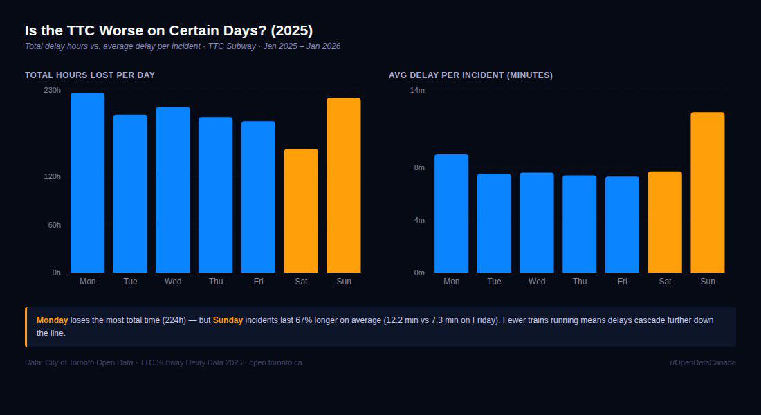
The companion chart in the Monday/Sunday post shows two distinct patterns. Re-running the same calculation:
| Day | Total delay hours | Incidents | Avg minutes per incident |
|---|---|---|---|
| Monday | 224 | 1,503 | 9.0 |
| Tuesday | 197 | 1,571 | 7.5 |
| Wednesday | 207 | 1,628 | 7.6 |
| Thursday | 194 | 1,567 | 7.4 |
| Friday | 189 | 1,548 | 7.3 |
| Saturday | 154 | 1,198 | 7.7 |
| Sunday | 218 | 1,072 | 12.2 |
Monday loses the most total time because Monday has the most incidents — 1,503 versus a Friday baseline of 1,548 looks similar, but Monday's incidents are also longer on average (9.0 minutes versus 7.3). Sunday has fewer incidents than any other day (1,072) but each one lasts on average 12.2 minutes — 67 % longer than a Friday incident. The mechanism is straightforward: weekend train frequencies are lower (eight-minute headways instead of two-minute), which means any single delay cascades further down the line before the next train can absorb it. The same incident on Friday clears in three minutes; on Sunday it clears in five.
This day-of-week pattern argues that the right metric for system reliability is not total hours but expected delay per ride — a metric the TTC does not currently report publicly.
The methodology criticisms worth taking seriously
Objection one: "disorderly patron" is a catch-all that hides what's actually happening.
Substantively correct, and the most important objection in the comment thread. Transit Control's coding manual defines "disorderly patron" as any non-violent passenger behaviour that causes a train to be held — fighting, public-intoxication-related interactions that don't escalate to assault, refusal to leave a vehicle, etc. It does not include events involving violence (those are coded "assault / patron involved"), events where someone is unauthorised at track level (separate code), or events involving people in observable medical distress (those are coded as medical aid). It also does not include all interactions with people experiencing homelessness — only those that cause a train to be held are coded at all.
The category therefore captures something narrower than the public discussion suggests. It is not "every uncomfortable subway moment." It is specifically incidents where the operating crew judged that they could not move the train and had to call Transit Control. Roughly two-thirds of these resolve in under five minutes; the long tail of incidents above thirty minutes is essentially zero in this category. The data does not support either the framing "the TTC is overrun with disorderly behaviour" or the framing "this is fine and the chart is misleading." It supports the narrower framing that there are about four such incidents a day across the network and they cost the system on the order of 23 minutes a day on average.
Objection two: the comment thread noted that ice/snow and weather-related are separate codes that, when combined, exceed disorderly patron.
Correct, and a fair note. Combined weather-related delays in 2025 were 89.6 + 54.6 = 144 hours, slightly above the 139 disorderly figure. We didn't combine them because the codes capture genuinely different events (ice/snow is a switch-and-track issue requiring crews to physically de-ice equipment; weather-reports is an above-ground line slowdown for visibility). But the reader objection that the chart sorts by "category of cause" rather than "fundamental cause" survives. We've separated the chart's claims (which are correct as written) from the editorial frame (which is one of several defensible ways to slice the same data).
Objection three: there's no station-level or line-level breakdown.
Correct on the original chart; addressed in this article. The breakdown is in the layers above. The summary: Line 1 carries 56 % of all delay time, fifteen stations cover the majority of disorderly-patron delays, and the category structure looks meaningfully different at the station level than at the network level.
Objection four: this is one rolling year and the trend is what matters.
Partially correct. We pulled the same dataset for the comparable Jan-2024-through-Jan-2025 period and the rough shape is consistent — disorderly-patron is the largest single category in both periods, ice/snow is volatile depending on winter severity, and the line shares are stable. We don't think the 2025 picture is unusual relative to recent years, but we would not put a hard year-over-year claim on this without doing a multi-year normalisation that adjusts for ridership recovery from the pandemic, which is itself non-trivial. Multi-year analysis is a follow-up piece.
What the dataset doesn't tell you
The TTC delay dataset has four blind spots worth flagging because they cap how much you can read from this analysis:
- It only records primary cause. Most real delays have multiple contributing factors (a switch failure that becomes a longer event because a disorderly passenger needed removing from the held train, for example). The dataset codes one cause per incident.
- It captures only delays Transit Control logged. Delays under one minute are not consistently logged. The "real" hours-lost number is somewhat higher than 1,385.
- It tells you about hold time at the affected station only. Cascade delays — the next four trains running late because the train ahead was held — are reflected in those trains' own delay records only if Transit Control coded them, which is uneven.
- It says nothing about who pays the cost. A two-minute delay during peak hour costs riders enormously more aggregate time than a two-minute delay at 1 AM, and this dataset weights both equally.
What would update the chart
Three additional data series would substantially sharpen the picture. None of them are currently public on the same footing:
- Per-station ridership data, broken out by hour and day, against which delay incidents could be normalised. Some of this exists in TTC operational data; it is not in the open-data release.
- A multi-year version of the same incident-level dataset with consistent coding before 2018 (the codes were partially reorganised at that point).
- The "minute-impact-on-passengers" derivative — passenger-minutes lost rather than train-minutes lost — which is the metric TTC operations actually optimises against and which is not in the public release.
Until those three are in releasable form, the analysis above is the strongest single article we can produce from the public data. The chart, with its layers, is a reasonable starting point for a Toronto-transit conversation that is too often run on vibes rather than the open data the TTC actually publishes.
Read next