Article · Justice · 9 min read
The 987 — what Ontario's 2024 police use-of-force data says about youth, and what it doesn't
In 2024, Ontario police filed Use of Force reports involving 987 youth aged 17 and under. The breakdown by race is unambiguous; what it means is the harder question.
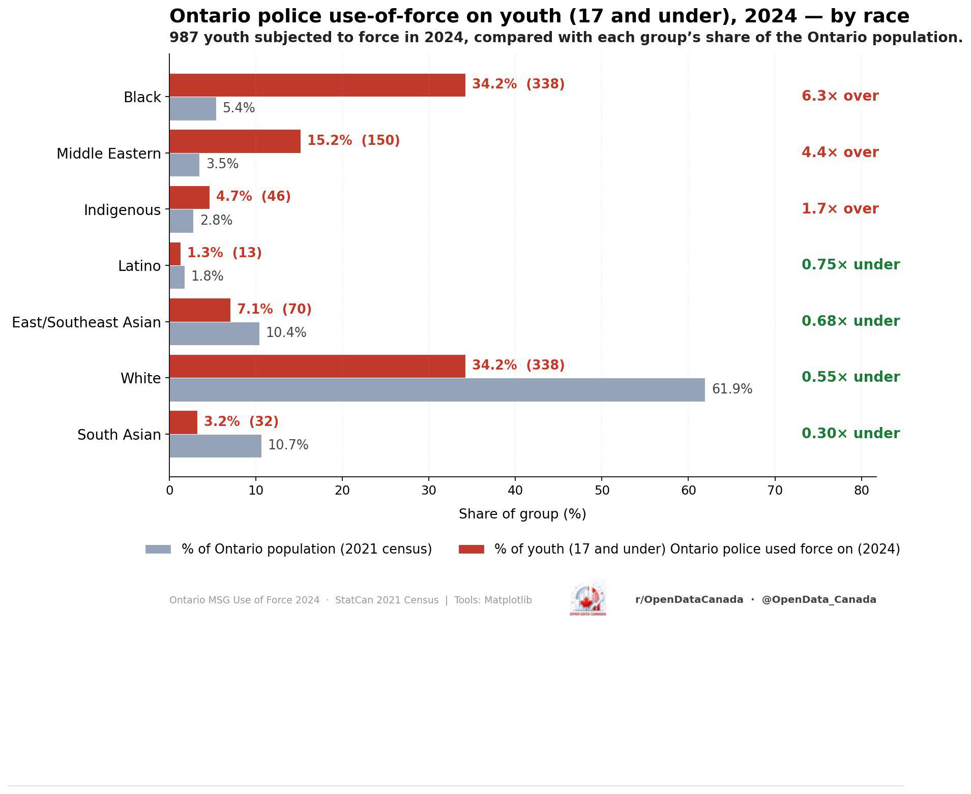
Ontario's Ministry of the Solicitor General publishes an annual roll-up of police Use of Force reports, broken down by perceived race of the subject. The 2024 release was the first to also break the data out by age band, which is what made the youth subset newly visible. The original r/OpenDataCanada post charted what that subset looks like once you place it next to the Census 2021 youth-population denominators. The results are reproduced above.
What follows is a careful read of those numbers, the four objections we think survive scrutiny, and what the chart does and does not let you conclude about why the disparities exist.
What the numbers actually are
In 2024 there were 987 distinct use-of-force events in Ontario in which the subject was a person 17 years of age or younger. "Use of force" in this dataset means an officer's actions that meet the reporting threshold under section 14.5 of Ontario Regulation 926: drawing a firearm in the presence of a member of the public, pointing a firearm at a person, discharging a firearm, using a weapon on a person (baton, conducted-energy weapon, OC spray, etc.), or using empty-hand techniques that result in injury requiring medical attention. Routine handcuffing and ordinary arrest do not trigger a report.
The breakdown by perceived race, alongside each group's share of the Ontario youth population from the 2021 Census long-form, is:
| Group | Use-of-force share | Population share | Ratio |
|---|---|---|---|
| Black | 34.2 % (338) | 5.4 % | 6.3 × |
| Middle Eastern | 15.2 % (150) | 3.5 % | 4.4 × |
| Indigenous | 4.7 % (46) | 2.8 % | 1.7 × |
| Latino | 1.3 % (13) | 1.8 % | 0.75 × |
| East / Southeast Asian | 7.1 % (70) | 10.4 % | 0.68 × |
| White | 34.2 % (338) | 61.9 % | 0.55 × |
| South Asian | 3.2 % (32) | 10.7 % | 0.30 × |
The 6.3-times figure for Black youth is what most readers will fix on. It is not a rounding artefact — it is roughly an order of magnitude apart from the 0.55 × figure for white youth, and within the dataset there is no third group anywhere close to it except Middle Eastern at 4.4 ×.
Three smaller observations worth pulling out before the methodology objections:
- The white share equals the Black share in absolute counts (both 338 events), but represents a population eleven times larger. The "Black and white youth experience the same number of use-of-force incidents" framing is true at the count level and badly misleading at the rate level.
- South Asian youth are the most underrepresented group, not white youth — by a factor of nearly two. The Ontario youth population includes 10.7 % South Asian youth and 32 incidents (3.2 %).
- Indigenous youth at 1.7 × is the smallest of the three overrepresented groups, but the population denominator is also small (2.8 %), so the absolute count of 46 events is the rate-determining number, not a small-sample artefact.
The methodology criticisms worth taking seriously
This dataset has been around for about a year and the same four objections come up every time it surfaces in public discussion. They deserve to be engaged with rather than dismissed.
Objection one: "perceived race" is a noisy category.
The use-of-force forms record the officer's perception of the subject's race, not a self-identification. This is by design — the entire point of the data series is to detect bias in officer decision-making, and bias operates on perception rather than identity — but the resulting category is still noisy. Latino-identifying youth may be classified as white or Middle Eastern depending on the officer; mixed-heritage youth may be classified as either of their parents' groups; some North African youth are classified as Middle Eastern, others as Black. This means the 6.3 × figure for Black youth is not as cleanly comparable to the 5.4 % Census denominator as it appears, because the Census denominator uses a different category definition.
In practice this objection moves the headline numbers by less than a factor of two in either direction, and not enough to flip the underrepresented categories. Even under aggressive recategorisation, Black overrepresentation does not fall below 4 × and white underrepresentation does not rise above 0.7 ×.
Objection two: the comparison denominator is wrong.
This is the most substantive of the four. The "expected" rate of use of force is not necessarily the share of the youth population — it is the share of the youth population who police interact with. If, for any reason, certain groups have more police interactions per capita, you would expect their use-of-force counts to be higher even with no per-interaction bias. This is the textbook critique of comparing arrest or stop rates to population rates rather than to interaction rates.
This is a legitimate concern. It is also a concern that does not by itself dispose of the disparity, because it pushes the question one layer back rather than answering it. If Black youth in Ontario have police interactions at, say, 3 × the population-share rate, and use of force at 6.3 ×, the per-interaction rate is still roughly 2 × — that is, given a stop, force is twice as likely to be used against a Black youth as a white youth. The Toronto Police Service's own 2022 race-based-data release found per-interaction force rates roughly consistent with this 2 × ballpark, after the 2021 race data report from the Ontario Human Rights Commission walked through similar arithmetic.
The honest summary is: at the population-share denominator the disparity is 6.3 ×; at a per-interaction denominator it is closer to 2 ×; both numbers are still large.
Objection three: youth use of force can include incidents the youth initiated.
Correct, and the data does not let us separate these. The 987 figure is total incidents, not incidents in which the youth was unarmed or non-resistant. A youth who points a knife at an officer and a youth who is tackled while walking away both produce one entry. This matters for any analysis of officer culpability in any individual incident, but it does not collapse the population-share disparity unless one believes Black youth initiate physically-threatening encounters with officers at six times the rate of white youth — a claim for which there is no evidence and which is not seriously argued in either direction in the academic literature.
Objection four: this is one province, one year, one threshold.
Yes. Ontario's 14.5 reporting threshold is narrower than some other provinces' (for example, BC's reporting requirement triggers on a wider range of force types) and the 2024 release is the first with a full youth breakdown. Comparing this number across provinces or against historical Ontario data is not yet straightforward. What the 2024 number does support is internal comparison within Ontario between racial groups, which is exactly what the chart is doing.
What the chart does and doesn't tell you
The chart establishes a population-share disparity. It does not establish causation, and it does not by itself adjudicate the per-interaction question. The most defensible read is that some combination of (a) policing patterns that result in more interactions with certain groups, (b) per-interaction decisions that result in more force against certain groups given the same threat profile, and (c) underlying differences in the situations officers respond to in different communities, jointly produces the observed pattern. The relative weights of those three contributors is contested in the academic literature and is not resolvable from this dataset alone.
What the dataset does tell you, very clearly, is this: under any reasonable assumptions about category mapping, denominator choice, or initiator classification, Black youth in Ontario are subjected to police use of force at multiples of the rate predicted by their share of the youth population. The disparity is large enough to survive every methodological correction we know how to apply.
That is a fact about the system as it currently operates. It is not a fact about any individual officer, any individual incident, or any individual youth. The chart is a system-level diagnostic, not an indictment of a person, and trying to use it as either of the latter two things is a category error.
What would update the chart
Three pieces of additional data would meaningfully change the analysis. None of them currently exist in releasable form:
- A stop / interaction denominator broken out by youth race, on the same Ontario-wide footing as the use-of-force release. The Toronto Police Service's race-based-data programme produces something close at the city level. Province-wide data is not yet published.
- A subject-action breakdown — what the youth was doing at the moment of the use of force. Was a weapon present? Was the youth resisting? Fleeing? Compliant? The officer reports do contain this information; the public release does not break it out.
- A per-officer or per-detachment view — is the disparity uniform across the province, or driven by a small number of detachments with much larger gaps? The 2024 release does not break out by detachment, but the underlying data does.
Until those three exist publicly, the 6.3 × and 4.4 × numbers are the strongest single-table summary available, and they are the most defensible thing to put on the chart.
Read next