Article · Housing · 8 min read
Toronto rates its apartments two ways — and they almost never agree on which buildings are worst
Last summer, Mayor Olivia Chow toured a tower in Beaches-East York where tenants had been calling 311 about mice, mould and broken windows for years. It turns out 500 Dawes Road is the only building in Toronto that both of the city's parallel rating systems agree is one of the worst — and that agreement is unusual enough that it might be why the mayor finally went.
Here's how Toronto keeps an eye on its apartment buildings. There are two ways, and they don't really talk to each other.
The first way is the scheduled inspection. Every two years, a bylaw officer walks through the common areas of every apartment building with three or more storeys and ten or more units — about 3,600 buildings citywide. They check fifty things: exterior walls, balcony guards, lobby ceilings, stairwell lighting, garbage rooms, pest-control logs. Each building ends up with a score out of 100. Since last October the score has been printed on a coloured sign at the entrance — green if the score is 85 or higher, yellow if it's between 70 and 84, red if it's below 70.
The second way is the complaint line. When a tenant calls 311 about a leaking ceiling or a hallway full of garbage, the city opens an investigation, an inspector comes out and writes up the deficiencies. They land in a database called MLS Investigation Activity that anyone can download.
The two systems were designed to do different jobs. One looks at every building on a schedule. The other only looks when something goes wrong. You'd think they'd mostly agree about which buildings are the worst — and they don't.
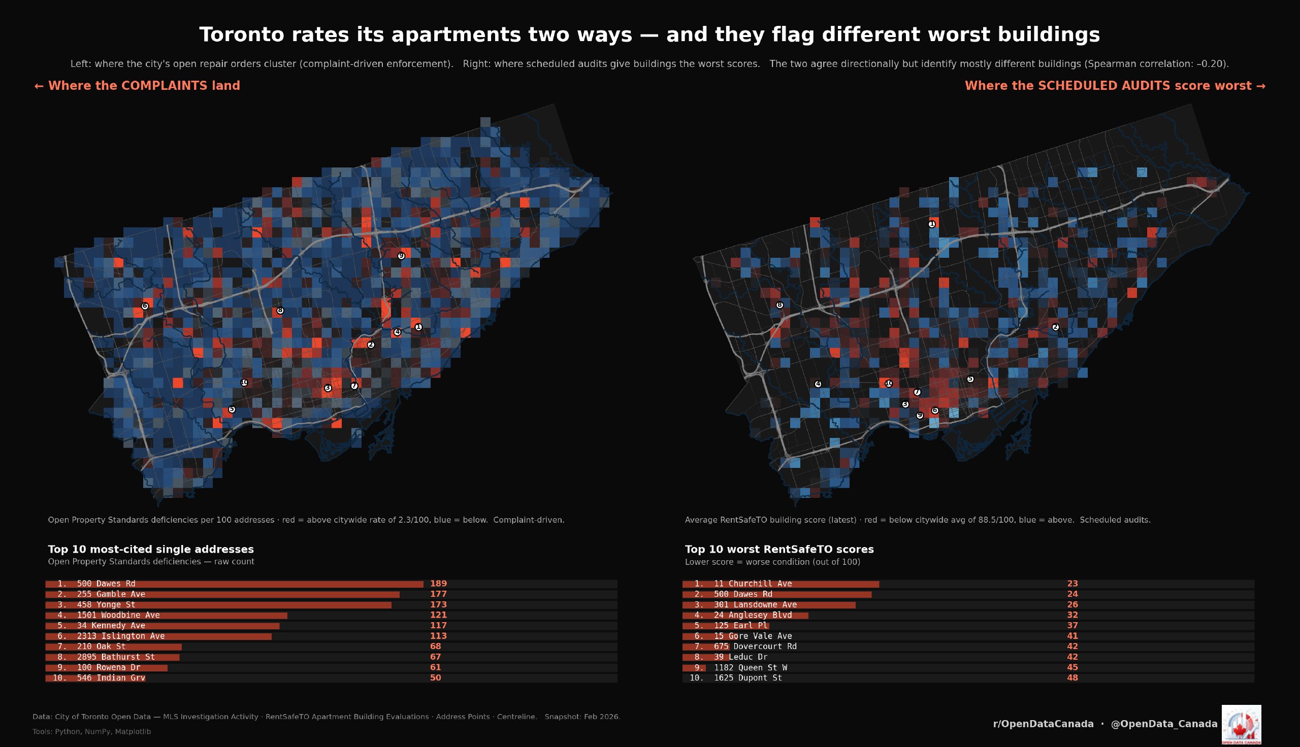
The chart, in plain English
The maps at the top of this article show both systems on the same city. Red squares on the left mean lots of open complaints. Red squares on the right mean low audit scores. If the two systems agreed, the maps would look more or less the same. They don't.
Statisticians have a way of measuring how much two rankings agree. A score of 1.0 would mean perfect agreement. A score of 0 would mean the rankings have nothing to do with each other. Negative numbers mean the two rankings actively disagree. The agreement between Toronto's complaint counts and its audit scores is −0.20 — basically nothing, and slightly worse than nothing. If you took a building's complaint count and tried to predict its audit score, you'd be right about 4 % of the time. The other 96 % is buildings the two systems don't see the same way.
You can see this in the top-10 lists at the bottom of the chart. Here are the addresses where the most complaints are still open:
| Rank | Most-complained-about address | Open deficiencies |
|---|---|---|
| 1 | 500 Dawes Rd | 189 |
| 2 | 255 Gamble Ave | 177 |
| 3 | 458 Yonge St | 173 |
| 4 | 1501 Woodbine Ave | 121 |
| 5 | 34 Kennedy Ave | 117 |
| 6 | 2313 Islington Ave | 113 |
| 7 | 100 Rowena Dr | 80 |
| 8 | 210 Oak St | 68 |
| 9 | 2895 Bathurst St | 67 |
| 10 | 546 Indian Grv | 50 |
And here are the addresses with the worst audit scores:
| Rank | Worst-audit address | Score | Units |
|---|---|---|---|
| 1 | 11 Churchill Ave | 23 | 17 |
| 2 | 301 Lansdowne Ave | 26 | 35 |
| 3 | 500 Dawes Rd | 29 | 332 |
| 4 | 24 Anglesey Blvd | 32 | 22 |
| 5 | 125 Earl Pl | 37 | 15 |
| 6 | 15 Gore Vale Ave | 41 | 10 |
| 7 | 39 Leduc Dr | 42 | 13 |
| 8 | 675 Dovercourt Rd | 42 | 11 |
| 9 | 1182 Queen St W | 45 | 25 |
| 10 | 1625 Dupont St | 48 | 10 |
Compare them. Twenty addresses, almost no overlap. The only building on both is 500 Dawes Road.
What 500 Dawes Road is
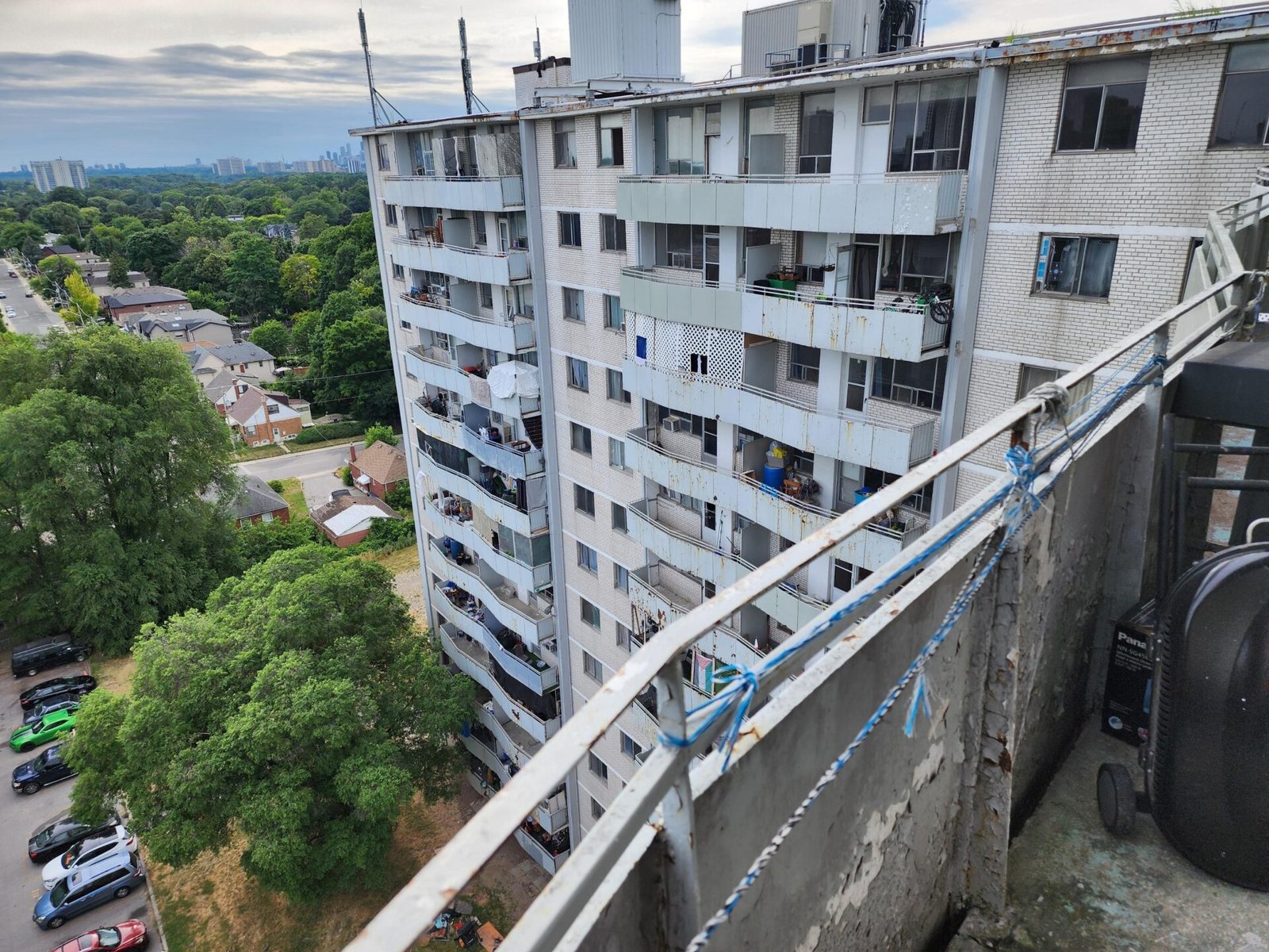
A 14-storey concrete tower built in 1966, on a stretch of Dawes north of the Danforth, on the east edge of the city. Three hundred and thirty-two apartments. Bedbugs in the walls, mould in the bathrooms, broken intercoms, mice in the kitchens, no heat for stretches of the winter. Toronto ACORN, the tenant advocacy group, has been running "State of Repair" surveys at the building since 2016. Last summer they brought the mayor by for a tour.
The audit gave it a base score of 51 — already deep in the red. Then the city applied a 22-point penalty, the largest single penalty in the entire dataset, because of all the complaints between inspections. Final score: 29 out of 100.
In late March, City Council passed Mayor Chow's "Cracking Down on Bad Landlords" motion, which directed staff to do something the city hadn't done before at this scale: send its own crews to fix the building and bill the landlord. Today (4 May 2026) CP24 reported that the landlord has been fined $200,000 for the deteriorating conditions and that the city has used its remedial-action powers — about $120,000 of repair, pest control and safety work, billed back to the landlord — to start fixing the building directly.
Why the two systems disagree
If 500 Dawes is the building both systems caught, the rest of the worst-audit list is the buildings only one system caught.
Look at the unit counts. Of the ten worst-scoring buildings on the audit, eight have 25 units or fewer. They're small — single-property landlords, not corporate towers. Their audit failures affect twelve or twenty or thirty-five tenants. 500 Dawes Road, on the same list, has 332 units. The other nine combined have 175. If you weight by how many people live in each building, 500 Dawes alone accounts for more poorly-rated apartment-living than every other building on the worst-audit list put together.
Now look at the complaint list. Several of those addresses aren't even apartment buildings the audit covers. 458 Yonge St is a mixed-use building above a subway station, mostly commercial. The audit doesn't visit it. But people who live and work there can still call 311, and 173 deficiencies have piled up.
Then there's the geometry of how the audit works. Inspectors walk common areas only — lobbies, hallways, exterior walls, mechanical rooms. They don't enter individual apartments. So a building can have spotless lobbies and a 90 audit score while half the units have a mould problem the inspector never sees. The complaint line is the only system that picks that up.
The reverse happens too. 2313 Islington Ave has 113 deficiencies on file — a lot — but its audit score is 75, which is yellow, not red. The complaints are real. The audit isn't seeing them.
The colour-coded signs aren't really about complaints
The signs that went up on apartment doors last fall combine the audit score and the complaint penalty into one number. In theory they reflect both systems. In practice, of all 3,590 buildings, only 32 had their colour band changed by the complaint penalty. Twenty-six went from green to yellow, and six went from yellow to red. The other 99.1 % of buildings are wearing whichever colour the audit put them in.
That means the sign on the door is, almost always, the bylaw officer's last-visit opinion of the common areas. It's not telling you what tenants in the building have been calling 311 about. The two systems run in parallel; the sign program only barely brings them together.
This isn't a criticism of either system. The audit is doing what the audit does — catching deteriorating buildings before someone has to complain. The complaint line is doing what it does — catching things audits miss, like in-unit conditions and intermittent problems. They don't agree because they're built to look at different things.
Why this matters for who gets help
Here's the practical consequence. If you live in a 17-unit building like 11 Churchill Ave (the worst audit score in the city) and conditions are bad, your building shows up on every map that uses RentSafeTO data. Politicians can point to it. Reporters can write about it. The colour-coded sign at the door makes the situation legible to outsiders.
If you live in 458 Yonge St — a building where 173 complaints are sitting open — your building doesn't show up on the audit map at all. You're inside a system that isn't designed to surface your problem unless someone goes looking in the other dataset.
500 Dawes Road is the case study because it's the rare building both systems agreed about. Three hundred and thirty-two units, two parallel records of disrepair pointing at the same address, a tenant organisation pushing the building up the political agenda for a decade. That convergence is what made the mayor's visit and the council motion possible. For most buildings on either list, that convergence doesn't exist.
What to take from the chart
Three things, briefly.
One. Toronto's two apartment-rating systems disagree about who's worst more than they agree. That's a structural fact about how the systems are built, not a failure of either one.
Two. The colour-coded sign on a building's door is mostly telling you what the bylaw officer thought the last time they walked through the common areas. It's a useful signal, but it's not a complete one.
Three. Buildings that get political attention tend to be the ones where multiple records of disrepair line up. That makes 500 Dawes Road the exception, not the rule. The other 96 % of buildings have one record of trouble or the other, and the city's enforcement attention has to choose where to look.
The chart is built from two open datasets — the RentSafeTO Apartment Building Evaluations refreshed today and the MLS Investigation Activity bundle refreshed earlier this winter. Both are downloadable from the City of Toronto's open-data portal. Every number in this article was checked against the source files on 4 May 2026.